
Key takeaway
The five elements that make a landing page convert: a headline stating the outcome, a single clear CTA, social proof above the fold, no navigation menu, and a load time under two seconds.
A landing page has one job: convert a specific visitor, from a specific source, to take a specific action. Unlike your homepage (which serves multiple audiences with multiple goals) or a service page (which is primarily informational), a landing page is designed around a single offer and a single call to action. Done well, landing pages dramatically outperform generic pages for paid traffic, email campaigns, and partnership referrals — because they eliminate the distraction and friction that general-purpose pages contain by design.
This guide covers the principles behind high-converting landing pages, the structural elements that determine whether a visitor converts or exits, and common design mistakes that reduce conversions even on technically well-built pages.
What Makes a Landing Page Different
The core discipline of a landing page is removing every element that does not serve the conversion goal. Homepage navigation, sidebar widgets, related content links, social sharing buttons, footer menus — all of these give visitors routes away from the conversion path. Research consistently shows that removing navigation from landing pages increases conversion rate by 10-30%. The visitor arrived with a specific intent; the landing page should have no exits other than converting or leaving.
Landing pages also succeed or fail based on message match: the alignment between what the ad or email said and what the landing page delivers. A visitor who clicked an ad reading “Free Website Audit” who lands on a generic homepage with no mention of a free audit experiences a jarring disconnect. Message match means the headline, imagery, and offer on the landing page should directly mirror the language and promise of the source that sent the visitor.
Innovative Momentum
Want to implement these strategies for your business?
We help businesses grow with digital marketing, SEO, and AI-ready content strategies.
The Anatomy of a High-Converting Landing Page
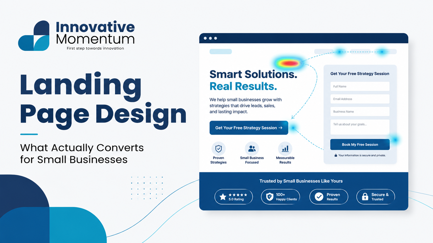
Above-the-fold section
Everything visible before the visitor scrolls must do the heavy lifting of the entire page. The above-fold section should contain:
- Headline: The primary value proposition in one sentence. Focus on the outcome the visitor gets, not what you do. “More qualified B2B leads from your website” beats “Digital marketing services for businesses.”
- Subheadline: One supporting sentence adding specificity — who it is for, how it works, or a key differentiator.
- Hero image or video: Visual content that reinforces the headline rather than decorating it. Product screenshots, before/after visuals, or a short video showing the outcome convert better than stock photography.
- Primary CTA: A single, specific button above the fold. The button text should state the action and the outcome: “Get My Free Audit,” “Book a 30-Minute Call,” “Download the Guide Now.”
Social proof section
Within the first two scrolls, provide evidence that the offer works. Visitor skepticism is highest at the beginning of a page visit. A short section with 2-3 specific testimonials (full name, company, specific result), client logos, or a key statistic (“300+ businesses improved” or “4.9-star average from 48 reviews”) immediately addresses the unspoken question: “Does this actually work?”
For a deeper look at building the social proof that makes landing pages and service pages convert, our guide on getting more Google reviews covers the systematic approach to collecting and using review-based social proof.
Benefits vs features section
Most landing pages list features; the best ones lead with benefits and use features as supporting evidence. The mental translation visitors need to make: “This tool records heat maps” (feature) → “You’ll see exactly where visitors get confused on your site and stop losing sales” (benefit). Always lead with the visitor’s outcome, then explain how your product or service delivers it.
Structure this section as 3-4 key benefits, each with a short supporting explanation. More than five benefits in a list loses the visitor’s attention; fewer than three feels thin. Specificity matters: “Improve your conversion rate” is vague; “Convert 20-40% more visitors with targeted landing page changes” gives the visitor a concrete expectation.
Objection handling section
Every visitor has objections — reasons not to convert. Common objections include: it costs too much, it will take too long, I’m not sure it works for my situation, or I’m not ready to commit. Effective landing pages anticipate and address the most common objections directly, either in a dedicated FAQ section or woven into the copy. Stating the objection and addressing it is more persuasive than ignoring it — acknowledging that your service requires time investment and explaining why it is worth it converts better than pretending there is no time cost.
Secondary CTA and close
Visitors who reach the bottom of the page have read everything — they are seriously considering converting. Repeat the primary CTA (same action, same button copy) at the bottom of the page with a reinforcing statement that captures the total value of converting: “Join 300+ businesses that generate more qualified leads. Book your free 30-minute strategy call.”
Form Design and Conversion
The form is the final friction point before conversion. Every field you add reduces the completion rate. The minimum viable form for most service business landing pages:
- First name (establishes personal connection in follow-up)
- Business email address
- One qualifying field (“What is your main challenge right now?” or “What service are you most interested in?”)
Remove: last name (get it when you talk), phone number (unless calls are your primary follow-up channel), company size (unless required for qualification), “how did you hear about us” (UTM parameters answer this automatically).
The form submit button is part of the conversion path, not an afterthought. Replace “Submit” with the specific outcome the visitor receives: “Send Me the Guide,” “Yes, Book My Call,” “Get My Free Audit.” The button copy reinforces the decision the visitor is making rather than describing the mechanical action.
Our guide on B2B website lead generation covers form optimization in the full context of lead generation, including how to connect form submissions to a CRM for lead tracking and nurture.
Page Speed and Mobile Performance
A landing page that loads slowly on mobile is a landing page that does not convert on mobile — and most paid traffic arrives on mobile devices. The LCP (Largest Contentful Paint) target for landing pages is under 2.5 seconds on mobile. Test your landing page on Google’s PageSpeed Insights before launching any paid campaign.
Common landing page speed issues: hero images that are too large, custom font loading without fallbacks, third-party scripts (chat widgets, analytics libraries) loaded synchronously in the page head, and unoptimized JavaScript from landing page builders. Our guide on website speed optimization covers the specific fixes for each of these issues.
Testing and Iteration
No landing page is perfect from launch. The elements most worth testing, in order of potential impact:
- Headline copy: The highest-leverage variable on most landing pages. Test outcome-focused vs. mechanism-focused headlines (what you get vs. how it works).
- CTA button copy and color: Low-effort to test, measurable within days on moderate traffic volumes.
- Hero visual: Product screenshot vs. results chart vs. lifestyle image.
- Social proof format: Testimonial text vs. video testimonials vs. case study summaries.
Test one variable at a time, with enough traffic to reach statistical significance. As noted in our guide on Core Web Vitals, performance measurement requires sufficient sample sizes for meaningful conclusions — the same principle applies to A/B testing landing page elements.
For landing page design and conversion rate optimization, contact Innovative Momentum for a landing page strategy and build.
Frequently Asked Questions
How long should a landing page be?
Length should match the complexity of the decision. Short-form landing pages (one screen, minimal copy) work for low-commitment offers: a free resource, an email sign-up, a short trial. Long-form pages with extensive benefits, testimonials, and objection handling work better for high-commitment offers: significant service engagements, expensive purchases, or offers where trust needs to be built before the visitor will convert. The question is not “how long?” but “does this visitor have everything they need to make the decision at the end of this page?”
Should landing pages have navigation?
For paid traffic landing pages, removing navigation consistently increases conversion rate. Navigation gives visitors an easy exit to browse other pages, reducing focus on the conversion goal. For organic traffic landing pages (pages that rank in search), keeping navigation is important because users expect navigational options on pages they find through search. Use separate landing pages for paid campaigns rather than sending paid traffic to your regular service pages.
What is the difference between a landing page and a homepage?
A homepage is designed for multiple audiences and serves multiple goals simultaneously: introducing the business, showcasing services, directing visitors to the right section, building brand familiarity. A landing page is designed for one audience and one goal. Sending paid traffic to your homepage and sending it to a dedicated landing page for the same offer will typically produce a 2-5x difference in conversion rate in favour of the landing page.
Tracking and Measuring Landing Page Performance
A landing page you cannot measure is a landing page you cannot improve. Essential tracking setup before any paid traffic campaign launches:
- Conversion event in GA4: Configure a conversion event that fires when the form is successfully submitted or the thank-you page is reached. This is the primary performance metric.
- Heat mapping: Tools like Microsoft Clarity (free) or Hotjar show where visitors click, how far they scroll, and where they hesitate. A heat map showing that 70% of visitors never scroll past the hero section tells you something is wrong with the above-fold content that statistics alone would not reveal.
- Form analytics: Track which form fields are most frequently abandoned, how long visitors spend on each field, and the overall form completion rate. Many form builders include this natively; alternatively, configure GA4 field-level event tracking via Google Tag Manager.
- Source-level performance: Using UTM parameters on all traffic sources, compare conversion rates by source. Paid social traffic and paid search traffic may convert at very different rates on the same landing page — this information determines budget allocation decisions.
Landing Page SEO vs. PPC Landing Pages
Landing pages designed for paid traffic and landing pages optimized for organic search have different requirements that sometimes conflict. PPC landing pages benefit from removing navigation (reduces exits), having a single focused CTA, and prioritizing conversion rate above all else. SEO landing pages need navigation (users expect it for organic visits), benefit from longer-form content that answers searcher questions, and need to satisfy a range of search intents rather than a single specific offer.
The practical solution for most small businesses: maintain your regular service pages optimized for organic search with full navigation and content depth, and create dedicated PPC landing pages (separate URLs not linked from your main navigation) for paid campaigns. This keeps SEO-optimized pages intact while giving paid campaigns landing pages engineered purely for conversion. The technical setup requires either a separate directory (/landing/), a subdomain (campaigns.yoursite.com), or individual URLs managed as noindex pages if they would otherwise appear confusingly in organic results. For the on-page optimization of your organic service pages that feed organic traffic separately, see our on-page SEO checklist.
Landing Page Copy: The Framework That Converts
Effective landing page copy follows a predictable structure because it mirrors how a visitor processes a buying decision. The sequence: establish relevance (yes, this page is for you), create desire (here is what you get and why it matters), resolve objection (here is why it is safe to act), then make the ask (here is what to do next). Every line of copy should either build desire or resolve a specific objection — anything else is noise that increases cognitive load and reduces conversion rate.
The highest-leverage copywriting improvement most small business landing pages can make is replacing feature statements with outcome statements. “We provide certified Google Ads management” is a feature. “Our managed campaigns typically reduce cost-per-lead by 30-40% within the first 90 days” is an outcome. Visitors are buying the outcome, not the feature. Our guide on B2B lead generation tactics covers how to align landing page copy with the buyer’s decision stage — the same message that works for a bottom-of-funnel visitor actively researching providers does not work for a top-of-funnel visitor still defining their problem. For a landing page copy and design review for your campaigns, contact Innovative Momentum.

Keep reading
Related insights
No comments yet. Be the first to share your thoughts.